


Get The Latest Updates On New Arrivals, Sales + Promotions
Top 10 2024 Wedding Colors to AVOID—And What to Do Instead
One of the most important decisions you can make when it comes to your wedding is your color palette. It influences the mood of your space, and it can affect how you look in photos.
You’ll want to spend time researching trendy color combinations, but you should also think about what not to do.
Here are 10 2024 wedding colors to avoid, but before we get to specific wedding color palettes to avoid, let’s talk about bad color choices by culture.
Colors to Avoid By Culture
If incorporating cultural elements into your wedding is important to you, you’ll want to avoid colors that are considered inauspicious. For example, white and blue are Chinese wedding colors to avoid because they are traditionally associated with mourning. That can come as quite a shock, especially since white is a classic bridal hue in the United States!
Indian weddings are known for their bright colors. Women traditionally opt for red dresses with décor that often includes vibrant shades of turmeric, orange, and green. Indian wedding colors to avoid include black and white. Because they are so basic, they are considered bad luck wedding colors.
If you’re planning a Scottish or Irish wedding, you might automatically gravitate towards green. Although this color can safely be woven into your décor, the bride, groom, and bridal party should avoid wearing this hue. It’s thought to lure the faeries, and faeries always bring bad luck with them!
No matter what your culture, it’s always a good idea to think carefully about the traditions associated with the colors you may be interested in using. That said, there are some bad wedding color combinations, no matter what culture you’re from.
Here are some of the worst, along with what you can do instead to create a better wedding day color palette.
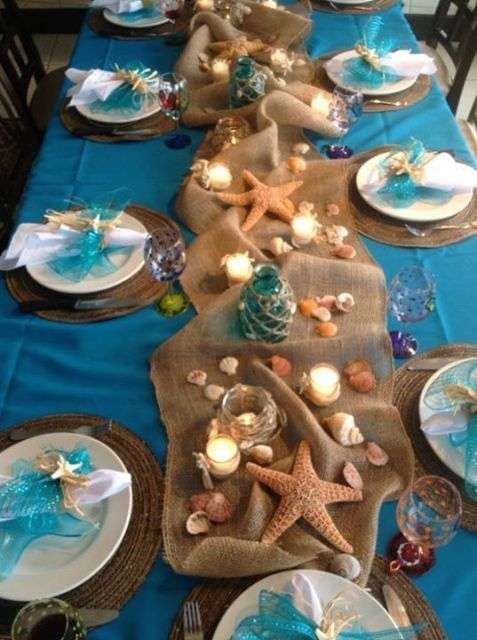
Turquoise Table Decorated With Burlap and Seashells: Arabia Weddings
Turquoise and Beige
Turquoise and beige are ugly wedding colors because this combination often comes across as immature. Your décor will end up looking like a bad prom, and that’s even true at a beach wedding. Not to mention, your bridesmaids and groomsmen probably won’t be thrilled to wear either hue.

Wedding Aisle Decoration With Eucalyputus, Pampas Grass, and Roses: Wedding Chicks
Do this instead:
Create a more mature palette by adding deeper shades of teal, and use both colors sparingly. Then, broaden your beige horizons by incorporating other neutral shades like rust, pine, sand, and copper. With a more robust combination of colors that doesn’t rely on using too much turquoise, you can create a much more pleasant color palette.

Black Reception Table With Black Feathers and Black Cala Lilies: The Skinny Confidential
Black on Black
Black tie weddings are a formal way to celebrate your nuptials. Just don’t take things too far. Too much black ends up looking funereal. It can make your décor look quite flat too, especially in pictures. It’s hard to pick up on layers and textures when everything is black.

Table Setting With White Candles, Black Goblets, and Greenery Garland: Style Me Pretty
Do this instead:
Even gothic weddings include other hues like plum, deep teal, or burgundy, so don’t be afraid to add some color! If you want to keep things simple, try a combination of black, white, and sage. Basic black and white can be lovely too, especially if you also incorporate moody grays.
 Table Settings With a Blue-Striped Tablecloth and Red Roses: The Every Last Detail
Combinations of Primary Colors
Some of the worst wedding colors include primary hues, especially when they are combined with each other. Think straight yellow with true blue and yellow with red, which are best left in preschool spaces. Red and blue, on the other hand, scream 4th of July.

Reception Tables Covered in Tropical Green Foliage With an Electric Blue Background: Eddie Zaratsian
Do this instead:
Stick with a single primary color when creating a color palette for your wedding. For example, if you want electric blue wedding colors, pair them with shades of forest-y green or lovely shades of lavender. If you want to use another primary color, choose a lighter shade of yellow or an almost-black shade of red so that they act like neutrals.

White Candles Surrounded by Orange Roses and Purple Dahlias: Dawn Elizabeth Studios
Purple and Brights
A combination of purple and brights is sure to grab your guests’ attention. But whew, they can be hard on the eyes! Shades like purple, orange, and pink will likely give your guests headaches as the night wears on, as will combinations of purple, bright yellow, and lime green. Not to mention, neon colors do nothing for the complexion. Also, we should mention that your wedding could end up looking like a soirée for the Joker or a Mardis Gras celebration.

Tall Flower Arrangement With Purple and Yellow Flowers on a Reception Table: Wedding Chicks
Do this instead:
Try leaning towards pastel shades for at least some of your colors to tone them down. Shades of lavender can look quite lovely with sherbet orange and blush. If you want to keep shades of electric yellow and green, try grounding them by incorporating the colors with organic details, like lemons and limes.

Bride Wearing a Red Jacket Holding a Red Rose Swag Floral Arrangement: Tidewater and Tulle
Too Much Red
Is red a bad color for a wedding? For a long time, the answer was yes. No wedding looks more like it came from the dollar store than one that features a wrinkled silk wedding dress with a red ribbon tied around the waist and boring flower arrangements full of red roses.
 Bride Wearing a Red Floral Dress and a Red Veil: Bridal Musings
Do this instead:
That said, red is actually a trending wedding color in 2024. The trick is to keep your décor fresh. Use pops of red in surprising ways with another color in the background, like white, black, or taupe. Combine various shades of red for a dynamic look, wear a red veil with a white dress, and choose interesting flowers, like red anthurium and poppies instead of roses.
 Sweetheart Table Decorated With a Plaid Tablecloth and Greenery: TLC
Red and Green
Red and green are definitely wedding colors to avoid, unless you’re planning a Christmas wedding, of course. Red and green in their rawest forms will always remind guests of the holiday season, so they aren’t a good pairing if you want to have a wedding that is less Christmas-themed.

Grooms Wearing Green and Magenta Suits Holding Hands: Heartthrob Weddings
Do this instead:
Tweak the colors and you could use this color combination in the summer and fall too. One of our favorite wedding color palettes in 2023 included Pantone's color of the year—Viva Magenta—along with a vibrant shade of spruce that almost borders on teal. It makes the colors look less like Christmas, especially if you avoid using details that scream winter, like evergreen boughs and cranberries.
 Reception Table With Elevated Floral Arrangement Featuring Yellow and Orange Flowers: Omastyle Bride
True Orange Paired With Just One Other Color
Oof! True orange is a tough color for a wedding! There’s just something cartoonish and almost clownish about it, especially if it’s used alone or with just one other color. Pair it with black and it looks like a Halloween celebration, pair it with yellow and it will look like a kid’s birthday party, pair it with pink and your guests’ eyes will water all night long.

Wedding Ceremony Space With Orange Chairs and Oversized Orange Flowers: IDN Times
Do this instead:
If you really have your heart set on using the truest shade of orange at your wedding, use it creatively, and tone it down with neutral hues in shades of cream, champagne, and blush, as well as dark, leafy greens. If you’re planning an autumnal wedding, combine it with the quirky shades of rustic pumpkins, like mustard yellow and rust.

Reception Space Covered In Towering Magenta Flowers: Party Slate
Overpowering Magenta
Magenta is a fun color that’s been added to weddings in the last few years, but tread carefully. Just like you can have too much orange or too much electric blue, you can have too much magenta. And when you do, it will completely take over your space, which means the attention of your guests will be on your loud décor and not on you.

Bride in a Magenta Skirt Kissing the Groom in Front of a Greenhouse: Green Wedding Shoes
Do this instead:
If you love magenta, incorporate it in just one way as part of a larger color palette. For example, magenta orchids look quite lovely when incorporated into a color palette of burgundy and navy or as part of an all-green wedding that incorporates green velvet and monstera plants.
 Wedding Cake Covered in Pink and Blue Flowers: Interflora
Pink and Blue
When it comes to wedding color palettes to avoid, there’s arguably no palette to avoid more than a combination of pink and blue. It will forever and always look like it belongs at a baby shower and not a wedding.

Blue Reception Table Decorated With Pink, Orange, and White Flowers: Colors Bridesmaid
Do this instead:
You will almost certainly have to include at least one more color in order to make this palette work at a wedding. White and soft shades of orange are lovely additions to a pink and blue wedding. It’s also helpful if you let a wildflower garden inspire your décor. Pink and blue bouquets look less like a baby shower centerpiece when they include delphinium, snapdragons, and Queen Anne's lace.

All-White Reception With Gold Chairs and a Gold Monogram on the Floor: Eddie Zaratsian
White and Gold
Surprisingly, white and gold don’t make the best wedding colors either. These bad wedding colors can come across as stuffy and pretentious, not opulent, like you hoped. They are very overdone, and just like it's hard to appreciate layers and textures with a black on black color palette, it's also hard with a palette of white and gold.
 Round Reception Table With a White, Green, and Blush Flower Arrangement: WedLuxe
Do this instead:
In 2024, you’ve got to add something extra to make this color palette come alive. Try including additional metals, like rose gold, silver, and copper to create a more dynamic color palette. It’s also helpful to add a washed-out hue, like a blush that’s almost white, to add some more depth to this otherwise plain palette.
Wedding colors are a very personal choice, so if you love something, go for it! Just make sure you think about your guests’ comfort, your complexion, and your pictures so you can be proud of the palette you chose when you look at your wedding album many years from now.